
Comparison Background
Why
How
In order to try and provide a consistent result, the same environment was used for all the tests. One dashboard was created per software with a changing data source consisting of a range of records between 1 to 30 million. Supplemental information about the data cardinality, software version etc. is detailed at the bottom of this post.
Skew
This comparison is used to provide a high level analysis. It uses random generated data, and therefore cannot replace a test with your own data and requirements. Each software handles data in a different manner and therefore results can skew according to the nature of the data.
Dashboards
In order to provide a fair comparison for the performance and resource usage. Three dashboards have been created, providing very similar information. These also provide a quick glance at the different visualization style used by each software.
Tableau Dashboard

Qlik Sense Dashboard

MicroStrategy Dashboard

Data Size on Disk
Each software saves data extracts in a different fashion, either by external files or embedding the data within the report file. For Tableau the TDE file size was checked, for Qlik Sense the QVF file and for MicroStrategy the MSTR file (embedded in an empty report).

The results showcases that the file size is quite similar between the software up until 10 Million rows. MicroStrategy and Tableau appear quite close together. However Tableau improved in testing done beyond this scope, which included 70 Million rows with only 124MB used by Tableau (the drop in disk space is assumed to be associated to a grouping/compression applied by Tableau).
Memory Usage
Each software uses different processes. The tests attempted to single-out the memory used for the dashboards by each software (upon opening the dashboard). For Tableau the memory size was taken from Tableau.exe, for MicroStategy from MicroStrategyDesktop.exe and for Qlik Sense from QlikSenseBrowser.exe & Engine.exe.
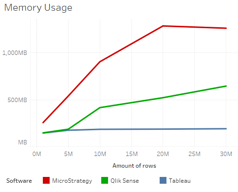
The results showcase that Tableau occupied the least amount of memory. Followed by Qlik Sense, which used a reasonable amount of memory. Lastly MicroStrategy occupied a large amount of memory and quickly deteriorated in performance and resource usage upon increasing the amount of rows beyond 10 Million.
Applying Filters
Each software uses filters in a different manner. Some use selection on the dashboards, while others use separate panes. For each software I noted the longest time it took to apply a filter in the dashboard based on the amount of records in the dashboard.

Tableau & Qlik Sense had similar performance in applying filters, and managed to handle this task with ease. Tableau was somewhat faster, but the results from Qlik Sense were on par with Tableau. MicroStrategy on the over hand, lagged behind with 23 seconds of wait time for applying a filter on a 5 Million rows dashboard. This continued to deteriorate up to 294 seconds for 30 Million rows.
Load Time
The last test conducted, checked the amount of seconds it took each software to load the dashboard. This test attempted to single out the time it took to load the dashboard (after the reporting software was already running).

Tableau excelled and did not require additional load time as the data grew. This might be due to the caching mechanism used in Tableau, but is also assumed to be attributed to the fact, that the extract size was not increasing with the increase of rows (beyond 30 Million the extract size remained very similar, possibly due to grouping/compression). Qlik Sense had a very reasonable load time up until 5 Million, however beyond this point the initial load time of the report was getting too long. MicroStrategy fell behind with already 53 seconds for 5 Million rows.
Conclusion

Additional Info
Please note that this comparison is based on out-of-the-box testing. For better results, you should optimize each software using best practices documentation.
The source database is Oracle XE. All data was loaded into data extracts of the reporting software, rather than using a live connection.
The sample data used has a low cardinality, with generated random numbers for Sales_Amount & Revenue_Amount. Full information about the cardinality in each column is detailed below (using an example of the 1 Million rows data set)

The software version used in the testing are:
- Tableau Desktop 10.0.0
- MicroStrategy Desktop 10.4.0
- Qlik Sense Desktop 3.1 SR1

Good data. Btw is this on Windows or Mac?
LikeLike
Good question. It is using Windows 7 with 8GB of RAM.
LikeLike
Very good comparison. Would you mind share your 1 million data set? When increase rows, do you also increase randomness of other other columns? or just row numbers of Sales & Revenue? Thanks!
LikeLike
When I increase the rows I increase the date range of the data (add more dates) but the rest of the dimensions have the same cardinality, and I continue to use the same random function from Oracle for the number of sales & revenue.
I will look shortly into uploading a TDE extract with the 1 million row data set.
LikeLiked by 1 person
Thanks a lot!
LikeLike
In the end I published the dashboard that consists of 1 million records. You can view it with the link below and download the workbook (with the data): https://public.tableau.com/views/SalesDashboardTesting1M/Sales_Dashboard
Let me know if you have any issues
LikeLike
I’d love if you could add more details to this testing (software version, all the files generated) so other could reproduce the same test with different hardware, software version and confirm your findings.
LikeLike
Sorry, missed the version information that is posted already.
I don’t think the method for generating the data is representative of a typical real-life scenario and would recommend you generate random items-storeid-date combinations.
LikeLike
Thank you for your comments. The test was done based on a aggregated table by day (ex: FCT_SALES_DAY). Therefore the dates representation is correct (all KPIs are aggregated per day for the dates range & other dimensions). I agree that for other dimensions, the occurrences/randomness could be altered to represent a more real-life scenario. However that would make the high-level analysis less clear, as the randomness can skew the resource usage etc, and I would need to detail the reasons for the skew (caused by the data). Therefore I thought it would be clearer to use the method illustrated above. I did try and mention this fact in the post: “This comparison is used to provide a high level analysis. It uses random generated data, and therefore cannot replace a test with your own data and requirements.”
LikeLike
GNARLY
LikeLike
One more question about the results. I notice in “Disk Space Usage”, Tableau has a big drop at 30M rows comparing to 20M data. That seems not correct, as usually the results should go up with more data. Also similar for results in “Memory Usage”, MicroStrategy also have a drop when increase memory 20 to 30 million rows. Tableau seems flat or a slight drop with increasing data size. These feel not common.
Thanks.
LikeLike
Actually I mentioned a few comments in the post about this. Ex: “the drop in disk space is assumed to be associated to a grouping/compression applied by Tableau”. I was also surprised at this behavior, and therefore I repeated it with another data set, and I encountered similar results. This also explain why the memory usage and load time of Tableau does not increase after the compression. If you encountered other findings, it would be interesting to know.
LikeLike
Here is some info from Tableau: http://www.tableau.com/about/blog/2014/7/understanding-tableau-data-extracts-part1. Perhaps in a future post, I will try and illustrate the compression behavior in detail.
LikeLike
Thanks a lot! This is a very interesting feature and I will take a look.
LikeLike
The memory comparison completely makes sense here. For desktop users with a meager 4 to 8GB of RAM , MSTR desktop is not a good tool for data exploration. it destabilizes the machine and the desktop pretty much hangs all the time. I have used tableau desktop to analyse 100 million plus rows of data on an 8GB ram machine and it was flying. Data exploration doesn’t mean you add the lowest grain to the detail and then try to render it. You are trying to get a high level view of data and then you explore by filtering. So Tableau is always sending smart queries to get a projection of the data. While for MSTR to do anything it will need everything to be loaded in memory. Tableau extract is a columnar database that’s compressed and is stored on disc and Tableau vizql is the smart language to query it. So tableau is kick ass here. But then it’s like a lamborghini which should not be given to every user in the company like Excel or you will break the bank. In a 1000 people company only 20 or 30 should get tableau desktop and they should develop governed reports and then MSTR I-server and web should be used to build same reports of parity. Tableau is horrible in pricing and as the number of tableau server users or desktop users increase then it becomes abominable. So a proper mix of these two tools can do wonders for your BI. MSTR Web on 100 Million row cube in a 40K I-server works like a charm for 1000+ users and you can use the same cube for so many things. I love mstr web and i-server but I loath mstr desktop as compared to tableau desktop it’s downright useless.
LikeLiked by 1 person
Microstrategy is trying to pack a Server product into a desktop product. Their engineers are used to asking people to use at least 256GB RAM servers and then they thrive. It’s like asking F16 designers to design a NetJet. Tableau from the beginning was focused on the desktop so they focused on compression, efficient memory usage. At this moment MSTR desktop is really piece of crap except for it being free. But free doesn’t have any value in corporate world where speed and efficiency matters. But if you flip the game and set up MSTR I-server and MSTR Web and hire $25 per hour folks to develop schema for an in memory cube and then throw 1000s of users on a cube of MSTR then you will do wonders with it. From one MSTR server you can do this , serve 1000s of users, send 1000s of excel feeds, Make data service end points for 1000s of users. And needless to MSTR visual insights on Web is awesome for grid based data discovery. So MSTR is for corporate but for finding insights in your data, Tableau is the tool. So use it to discover and use MSTR to serve the insights.
LikeLike
Thank you for your detailed comment. Indeed I believed MicroStrategy to be more of a corporate solution from the beginning. However they do actively compare it with Tableau Desktop (https://www.microstrategy.com/us/desktop), so I thought it is good to compare the two.
LikeLike
At least the memory usage comparison makes no sense here. Tableau doesn’t load the full dataset into memory but the aggregations you’re using in the charts. This is a performance penalty on every interaction compared to the others..
LikeLike
Thank you for your comment. What you mentioned is exactly the reason I made this comparison. I wanted to know how much memory will be used for each dashboard by each software (each dashboard containing exactly the same amount of rows and the same visualization). The fact that Tableau uses compression and only aggregated data in-memory, is something that is clearly seen by the results and is the whole purpose for the comparison.
LikeLike
This oversimplified “use case” doesn’t tell anything. If you would force Tableau to load all data into memory (using a cart on most detailed level) you will see the curve hitting the roove because of poor compression compared to the others..
LikeLike
Each software had the same amount of data, the same visualization and the same use-case. Therefore it does tell a lot about each software and the amount of resources used.
If you would like to explore the data deeper than the prepared dashboard (as you mentioned), then all software will encounter higher memory (With Tableau & QlikSense having higher peak percentages than MicroStrategy). Based on my comparison, If I will need to send a prepared dashboard by a Desktop reporting software to a colleague, I would probably not use MicroStrategy (due to high memory & long load/filter times). That is the main lesson from the comparison.
LikeLike
Thanks for this. What you didn’t account for is that whenever data is above a certain size (dep on use case), qlik devs will almost always do an incremental load.. This is also done by a server behind the scenes in batch. So you’re not really comparing apples to apples fully.
LikeLike
Thank you for the comment. Please note that my load time, refers only to the time it takes to open the dashboard and not the time it takes to load the data (into memory or external file): “This test attempted to single out the time it took to load the dashboard (after the reporting software was already running).”.
I think you might have been referring to the time it takes to fetch and load the data. Please correct me if I am wrong.
LikeLike
Tableau uses the same amount of RAM for 5mill rows as 30mill?!?!?
Tableau takes zero seconds to load an app of any size?!?!?
I think you might need to check your logic.
LikeLike
Don’t worry, I checked my logic multiple times. Tableau uses compression and in-memory caching which explains this behavior. The RAM stores the in-memory aggregation (in this data set the amount of dates are increased , together with new values for the measures. Tableau manages to keep the memory almost the same across 30 Million records, due to the in-memory aggregation). Lastly the dashboard when opened is only loading the in-memory aggregation, which again explains the fast load time.
LikeLike
You pre-aggregated data on day for Tableau. Did you do the same in MicroStrategy and Qlik Sense? Which of these dashboards allows users to get to the detail records?
Also, this data looks like a dream scenario for Tableau – narrow scope, low cardinality, high aggregation. What about when you have a more Qlik-like dashboard – high cardinality, low aggregation, lots and lots of dimensions to explore? Or how about a scenario where MicroStrategy will excel. How do they compare in those scenarios?
LikeLike
The data in the test indeed represents aggregated data with low cardinality (as mentioned in the post). The data source was exactly the same for all software. They all had the same high-level visualizations. Which was the use-case for this comparison.
Indeed this use-case was handled much better by Tableau & QlikSense, But that is a good lesson from this comparison. Regarding digging deeper into the data, this is possible by all software, and though not mentioned in this comparison. Tableau handled it with ease, while Microstrategy caused the computer to lag and make noises of almost exploding.
Regarding testing further with other scenarios (high cardinality etc.) I will try it out on the weekend and get back to you.
LikeLike
I found the whole comparison superficial and not really reflective of the real world. Nobody would implement MSTR as a bunch of ‘MSTR Desktop’ installed across an organization. In real world corporate situations, MSTR (from a performance ad scalability perspective) would dominate the other contenders in this analysis. All 3 tools have their place.
LikeLike
Scott – This comparison is purely a self-service (Desktop) Reporting comparison. It has nothing to do with a corporate infrastructure.
LikeLike
“Tableau uses compression and in-memory caching which explains this behavior.”
…and yet it takes zero seconds to load the app regardless.
“in-memory caching” means loading data into memory. That cannot take zero seconds, and will certainly take more time as you increase the data.
Also, “compression” of data is VERY different to pre-aggregation. The fact that disk space used fell as the data got larger shows that Tableau was aggregating data. Aggregation involves loss of detail and means that you are handling less rows of data. So in fact you are not comparing 30mill records across all platforms.
LikeLike
The load of Tableau was indeed very fast, this is probably because Tableau loads only the pre-aggregated data in-memory (the data shown in the visualization), this explains the fast load time. And this is the reality in this use-case.
The compression is indeed very different, but you don’t seem to understand it either.
Tableau compresses all the data, it does not remove level of detail in the data. As you need to be able to dig deeper into the data. If you want to read more about Tableau compression read here:
http://www.tableau.com/about/blog/2014/7/understanding-tableau-data-extracts-part1
Therefore Tableau manages to reduce the extract size and utilize smart compression techniques, while still maintaining all the data in the detail level it was retrieved.
LikeLike
Hey Lee –
(Tableau employee here, BTW) There are a number of different reasons why the numbers could be correct. The author hasn’t posted enough information to be sure, though.
Tableau’s goal is to deliver high *perceived* performance. One of the things we do in order to get there is cache the results of “answering questions” on the local machine under particular circumstances. Since Yaron is using a TDE file, it is trivial (and very fast) to understand if the data has changed. Assuming it hasn’t, we can leverage this “external cache” instead re-executing a query which was fired hours (or days) ago. The result is sub-second performance. This is the most probable explanation for < 1 second results
Is it smoke and mirrors? Yep, sure is. Would Tableau be slower if the external cache was "whacked" before the test was run? Most likely. But generally, users don't care. They are happy to get a correct, super-fast answer. The beauty of our external cache is that it can be leveraged to answer "other" questions beyond the original query it was generated in response to.
LikeLiked by 1 person
So you’re quite wrong again with Tableau: “Only data for the columns that have been requested is loaded into RAM.” Compared to Qlik Sense loads ALL data into memory and have it available at a fingertip vs. Tableau needs to fire a couple of queries to load other data on interactions! Btw. I can show you Tableau examples where the data in memory has 4-5 fold of size than the raw data especially with high cardinal values such as IDs, lat/lon etc. because of creation of “cubes”. Qlik Sense instead doesn’t need to create cubes or pre-aggregations and the compression is much higher.
LikeLiked by 1 person
Where did you see in my comment the mentioning of ‘Qlik Sense’ loading all data in memory? Or are you responding to someone else? It sounds like you are repeating exactly what I mentioned previously.
LikeLike
And indeed you can repeat this exam with high-cardinality (as you suggested). The results between the different software will be interesting to see.
LikeLike
Ralf,
(Not trolling, promise)
Your response is a great example of what an old boss taught me: “Never talk about a someone else’s underlying technology, because they know it better than you do and will generally show you you’re wrong”.
…because you’re wrong here. Tableau never has, and never will create in memory “cubes”. We are columnar, period. In addition, the author is correct. Tableau loads ONLY columns of data necessary to answer a question into RAM (vs. all of them). If a dashboard needs to fire X queries to populate X items in the dashboard, each will either leverage our longer-lived external query cache, shorter-lived in-process cache, or will simply load the next columns into RAM.
There are scenarios where Qlik is faster than Tableau. But there are also situations where Tableau is faster than Qlik. That’s the beauty of software.
LikeLike
“Cube” was probably the false term but what is a result set of the queries (underlying a chart) then if not a cube?
However you describe exactly what I meant before: Tableau loads the data on demand, Qlik loads all data upfront. Therefore the memory models are quite different to compare..
And please try an example in Tableau where you force to load all data on a granular (columnar) level to get all into memory at once. Then you will see the different compression ratios.
LikeLiked by 1 person
> what is a result set of the queries (underlying a chart) then if not a cube?
Not a cube. Based on you definition, essentially everything that is a resultset is a cube. No. Full stop.
I think the problem that you’re having with this author’s approach is that you want it to fit into your worldview of how columnar technology should work. “It should work like QlikView” because that’s what you’re most familiar with. I get it.
But, Tableau (and competitors like SiSense) are different. Applying “your” rules of engagement to them therefore doesn’t make sense. For example, you want this guy to load ALL the columns into RAM just to show that Qlik has a better compression rate. A Tableau person is going to respond with the following:
– Who cares IF the compression rate of Qlik is marginally better in some scenarios (I’ve never tested this, so for the sake of argument, I’ll take your word for it): The smartest thing to do is not do the work AT ALL.
– Who cares because Tableau’s caching capabilities will often allow a “desktop” or “server” user to get correct answers without evening need to HIT (and therefore load) the in-memory database in the first place
– Who cares because QLIK’s approach to columnar forces the user to invest in more hardware in order to STORE all that data in RAM (whether they use it or not).
As “Irritated Steve” said, I think the best thing for you to do is run your own tests using whatever methodologies you want, and then post them. If Tableau and/or MSTR fans take offense, they can post comments on your blog, and you can tell THEM what I’m saying now 🙂
LikeLike
Well, I’m just trying to tell that the two different models of handling in-memory data (Tableau vs. Qlik) are not comparable at all. So, this makes all of your charts useless.
LikeLiked by 1 person
Actually that is a great lesson from this comparison. As these different approaches of handling compression & in-memory data are clearly seen in the comparison. So quite useful for someone who wants to see a glimpse about how each software handles data in a different manner.
If this provokes people to investigate the compression & memory further with other scenarios (as can clearly be seen in the comments), then my mission is accomplished.
LikeLike
Ralf,
Your argument to clearly defend Qlik Sense(and maybe a career choice you’ve made) are tiresome. Give it a rest, or post your own results (unless, of course, you have no clue how to actually go about doing this in practice). Until then, stop trolling.
LikeLike
This is fine for one use case – although if you are pre-aggregating the data in Tableau you should also do it in the other tools. And you should test the performance of getting to the un-aggregated detail records in all the tools, not just filtering on high level dimensions. The comparison should at least be fair.
But in any organization, this would not be the only asset for sales information. You will have other content with sales, countries, product categories, etc. paired with other dimension information for different a different perspective on sales. And maybe you will have associated content that looks at inventory or production or sales rep efficiency.
I would like to see a scenario tested loading data for a much broader perspective – maybe 15 dimensions (wide) with high carnality in the data (lots of products, lots of sellers, lots of cities) on 100M rows allowing users to get to the detail level for any of the dimensions.
These are things you would be able to do in other tools that may not perform or scale so well in Tableau.
LikeLike
Thank you for your comment. Please note I am not pre-aggregating the data in Tableau. Otherwise this would indeed be not a fair comparison.
This in-memory aggregation is a built-in feature, and Qlik Sense also uses a some-what similar mechanism. So in this sense, the comparison is fair.
Regarding seeing an analysis with higher cardinality. Indeed this is something that I will test in the future. However based on my experience using Desktop software, Tableau handled this quite good compared to the rest. However if you use a Server solution, then you will probably find better solutions than Tableau.
LikeLike